
Effective Techniques for Integrating Data Tables Into Microsoft Excel Charts

Effective Techniques for Integrating Data Tables Into Microsoft Excel Charts
Quick Links
Key Takeaways
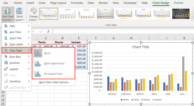
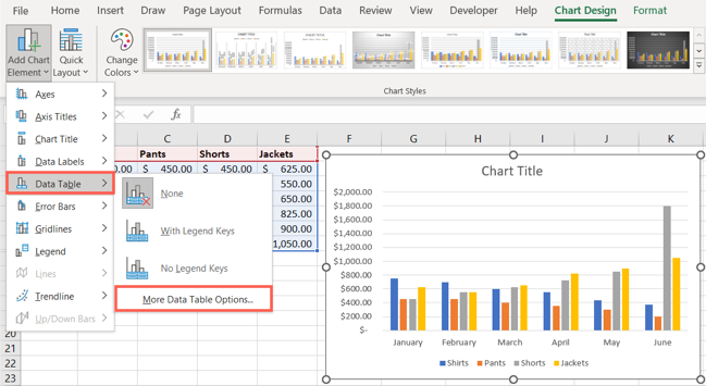
Select the “Chart Design” tab on the ribbon, click the “Add Chart Element” button, point to “Data Table,” and select the type of table you want to add. Select the “More Data Table Options” menu item to further customize your data table.
When you make a graph in Excel , you may want to include the source data with it. By adding a data table, which takes just a few steps, you can provide extra details or further explain your visual.
A data table is a grid of the data you use to create your chart that sits beneath the graph itself. Once you add a data table, you can format and customize it to your liking.
Add a Data Table to a Chart in Excel
You can add a data table to the most common types of charts in Excel, including bar , column, and line. Create your chart as you normally would. When you’re ready to add the data table, select the chart.
Related: How to Make a Bar Chart in Microsoft Excel
Go to the Chart Design tab that displays and click the Add Chart Element drop-down menu in the Chart Layouts section of the ribbon.

Move your cursor to Data Table and then choose the type of table you want to add from the pop-out menu. You can choose a table with or without legend keys.
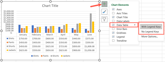
In Excel on Windows, you have an additional way to insert a data table. Click the Chart Elements button (+) on the top right or left corner of the chart. Check the box for Data Table and select the arrow to pick the type of table you want to use.
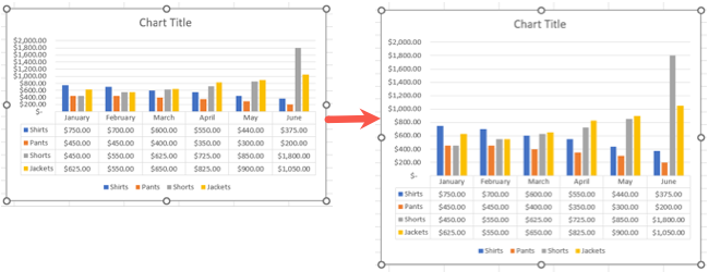
Once you add your table, you may need to resize your chart by dragging a corner or edge. This helps you give the chart and data table more room which makes them both easier to read.
If you decide later to remove the table, return to Chart Design > Add Chart Element and pick “None” in the Data Table pop-out menu.
Customize a Data Table in Excel
By default, a data table appears in a grid with borders and a white background. But you can customize the appearance of the table if you like.
Related: How to Create and Customize a Waterfall Chart in Microsoft Excel
Select the chart, click the Add Chart Element drop-down menu, and move to Data Table. Select “More Data Table Options” in the pop-out menu.
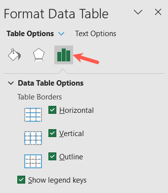
When the Format Data Table sidebar opens, confirm that you’re on the Table Options tab. Then, expand the Data Table Options section to see the borders.
You can check or uncheck the boxes to use horizontal, vertical, or outline borders. If you change your mind about the legend keys, check or uncheck the Show Legend Keys box.
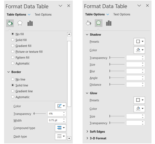
To change the fill and border settings, select the Fill & Line tab. You can choose a fill type and pick a color from the palette.
You can do the same thing for the borders directly beneath the data table, plus you can change the border width, line type, transparency, and other settings.
If you’d like to spruce up the data table with a shadow, glow, soft edge, or 3-D effect, head to the Effects tab. Here, you can experiment with different looks for your data table.
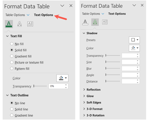
You can also change the font that displays within the table. At the top of the sidebar, choose Text Options. Use the Text Fill & Outline and Text Effects tabs to adjust the text fill style, font color, transparency, and effects.
Changing the Table Data
When you change the source data that appears in the chart, your chart will automatically update. The same goes for the data table within the chart.
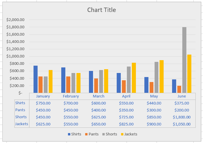
When you want to display the exact details for your Excel chart, consider using a data table. For additional help with graphs in Excel, check out how to apply a chart filter or how to find the chart type that fits your data best.
Also read:
- [New] 2024 Approved Best 6 Modern Homes for Minecraft Enthusiasts
- [New] In 2024, Storage Space Used for Daily Extended Videography
- [Updated] In 2024, Channel Surge Strategy Using YouTube Outros for Rapid Expansion
- Complete Guide: Steps to Perform Sysprep on Windows 11 - Easy Tutorial
- Dragon's Dogma 2 Crashes on PC: Solutions to Get You Playing Again
- How to Overcome the Dark Panel Problem in Epic Games Launcher - Solution Found
- In 2024, SRT Guide Everything You Should Know About SRT
- Interactive Subscription Buttons - Filmora's Guide to Animated Sign-Up Bars
- Netflix Fixes Streaming Issues on Xbox One
- Overcoming Detectability Challenges for Astro’s A50 in Command Center Setup
- Solving 'Audio Output Device Missing' On Windows 11
- Top Tips to Eliminate Ping Delays and Smooth Out Gameplay in Chivalry 2 [New Strategies]
- Title: Effective Techniques for Integrating Data Tables Into Microsoft Excel Charts
- Author: Paul
- Created at : 2024-12-03 17:10:16
- Updated at : 2024-12-06 16:24:28
- Link: https://win-able.techidaily.com/effective-techniques-for-integrating-data-tables-into-microsoft-excel-charts/
- License: This work is licensed under CC BY-NC-SA 4.0.